Works with: the sample · your own assets
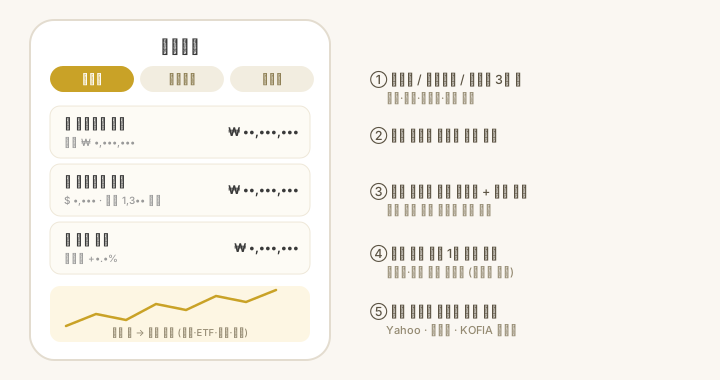
What is on it
- The total and gain sit on one line at the top.
- Choose by account / by holding. By account groups them; by holding flattens them — a holding spread over several accounts is merged into one row that names the accounts.
- Sorting is by amount · by gain · by name. Tap the same one again to flip to ascending.
- Accounts and holdings that drifted carry a badge next to the name, like
+5.0 pp. The threshold is set under Settings > My assets > Adjust when off by, and the whole app uses that one value. - The adjustment plan row above the list shows what to move and how much.
Tap a row for the account detail. Edit there changes quantity · average cost · target weight · cash, and tapping a holding shows its price and chart.
On Mac and iPad the accounts sit already expanded, side by side. There is nothing to tap into.
How it works
- Merging — the same holding is summed across accounts, and cash-like assets are summed into one.
- Prices refresh themselves — while you are looking at the app, prices refresh every 60 seconds. Pull down and they arrive at once regardless; when every market you hold is closed nothing can change, so nothing is fetched (crypto keeps refreshing around the clock). Values and weights recalculate immediately, but the average cost and quantity in your ledger do not move.
- The chart source is picked for you — Korean listing codes and exchange prefixes use Yahoo Finance (.KS/.KQ fallback), plain tickers use the Upbit KRW market (crypto), and fund standard codes (K + 11 digits) use KOFIA reference prices.
- Dollar holdings — the original dollar value, the rate applied and the won figure the app worked out are shown together. When there is no rate yet, it says so rather than treating it as zero.
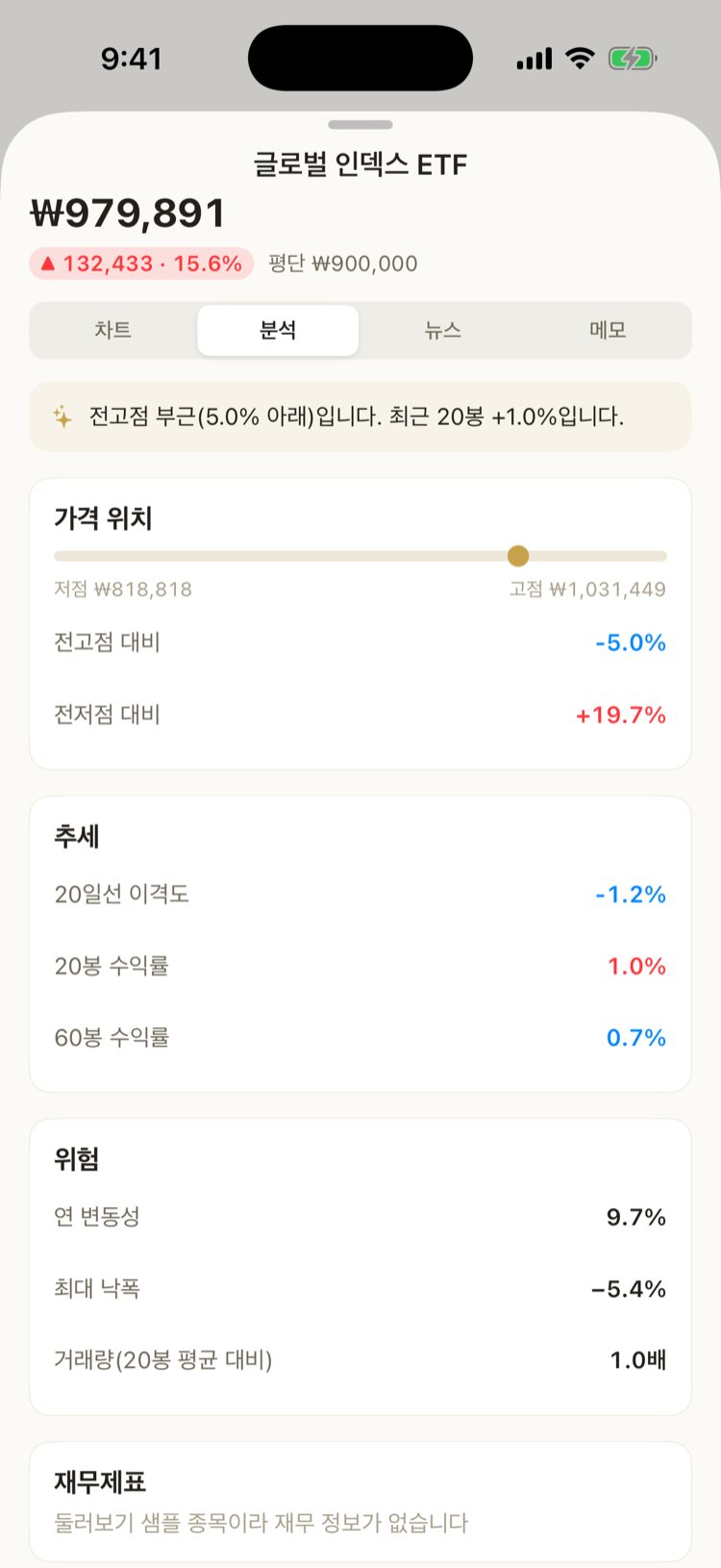
Holding detail — chart · analysis · news · notes
Tap a holding and four tabs open under its name and price.
- Chart — candles or a line, moving averages 5 · 20 · 200, and a volume profile. There are no period buttons: drag sideways for earlier stretches, and pinch to zoom. The source is the same as above.
- Analysis — technical indicators worked out from prices already fetched, plus financial statements.
- Technical indicators — where the price sits · moving-average order · disparity · period returns · annual volatility · max drawdown · volume ratio. A line that cannot be calculated is hidden rather than filled with a zero that would read as fact.
- Summary — rule-based sentences that only describe what is observed (instant, offline, and never a buy or sell call).
- Financial statements — income, balance sheet and cash flow, annual or quarterly. Foreign names come from SEC EDGAR; Korean ones from Naver Finance and DART filings (all free, no keys).
- ETFs — instead of statements you get the fee, base index, net assets, top holdings and sector weights.
- Trading flow — foreign ownership and the last 30 trading days of foreign and institutional net buying as bars (above the zero line is net buying, below is net selling). Source: Naver Finance.
- Shareholders — the largest shareholder and related parties, plus 5%-or-more holders such as the National Pension Service. It comes from DART filings, so it is as of the filing date and may differ from today. Trading flow and shareholders are Korean listings only — the foreign/institutional split and large-holding disclosures are features of the Korean market, so the cards do not appear for foreign names.
- News — news about that holding (the same source as news · reports).
- Notes — your own record per holding. Why you bought, where your stop is, what to watch, with a date. You can pick the date yourself, so an old trade can be written up later, and notes can be edited or deleted. You can also record a buy price · target · stop. Your average cost and the current price are shown above and a single tap drops either into the buy price; targets and stops can be entered as a percentage instead of a price (measured from your average cost, or the current price when you hold none — it is saved as the converted price). A target or stop you noted appears in the list with how far the price still has to go (%), and is highlighted as “reached” or “broken” when it gets there. The chart draws the target and stop as dashed lines like the average-cost line (with several notes, the highest target and the lowest stop are drawn). Turn on target · stop alerts in Settings > App and you are told when the price arrives (prices only come in while the app is open, so it fires while you are looking at it). Notes are kept on your device, survive “clear cache”, and are shared between your own devices over iCloud.
The chart also carries an average-cost line. The buy average worked out from the quantity and unit price in your ledger is laid over the chart as a teal dashed line, so you can see at a glance whether today's price is above or below it. When a holding is split across accounts, it is quantity-weighted. If the ledger currency differs from the chart currency, the line is not drawn — converting it would put it in the wrong place. Your average cost and the move against it also appear as numbers on the I hold card.